Movies Critics Loved, But Audience Really Didn't
Main Takeaway
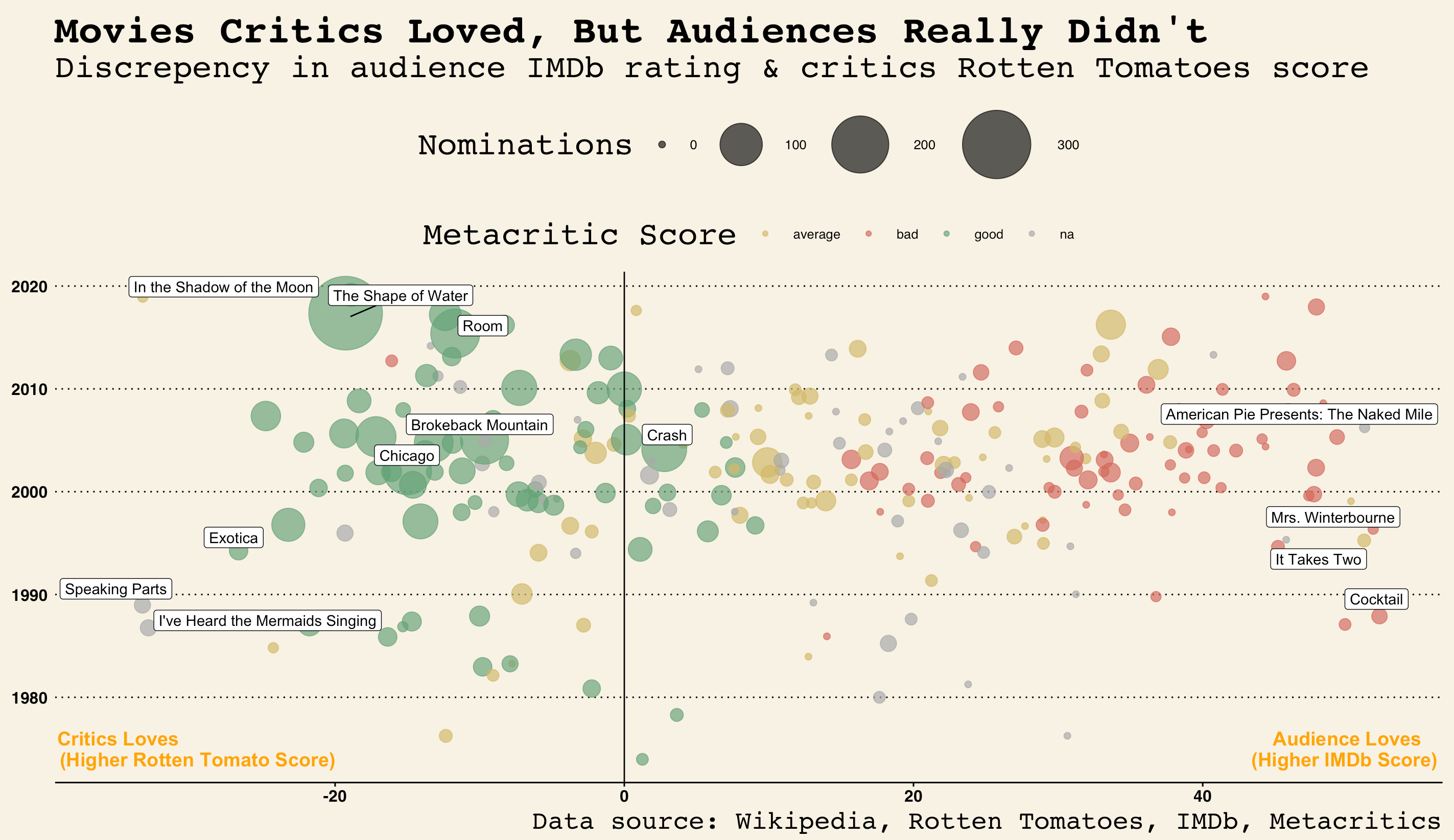
This visualization is a passion project that aims to show the discrepancy between critic’s opinions and audience’s opinions on the same movies, generated from a list of movies filmed in Toronto. Data were scraped from Wikipedia, IMDb, Metacritics, and Rotten Tomatoes website. The visualization uses three main scores:
- IMDb ratings, voted by the general audience;
- Rotten Tomatoes scores, voted by critics;
- and Metacritic scores, voted also by critics but the scores are weighted based on the reputation of critics, therefore more reputable.
The graph also depicts the number of nominations through the area of the circles.
Movies that are loved by critics but disliked by the audience (on the left side of the graph), receive more nominations than movies which are loved by audience and disliked by critics. Titles of movies on the extreme sides of the scale were also provided for reference.
Mini Tutorial
Data
Data were scraped from multiple sources. Scraped raw data can be found here.
After some data wrangling, prepared data ready to go for this analysis can be found here.
We need three packages: ggplot2 to build the graph, ggrepel for labels, and ggthemes for overall aesthetics.
library(ggplot2)
library(ggrepel)
library(ggthemes)
head(movies, 5)
## imdb_rating metascore tomato title year viewLOVE
## 1 56 NA 38 .45 2006 18
## 2 69 45 72 Adventures in Babysitting 1987 -3
## 3 38 12 4 The Adventures of Pluto Nash 2002 34
## 4 53 36 12 Against the Ropes 2004 41
## 5 53 NA 56 American Pie Presents: Beta House 2007 -3
## meta award nomination
## 1 na N/A NA
## 2 average 2 wins & 4 nominations. 4
## 3 bad 1 win & 12 nominations. 12
## 4 bad 2 nominations. 2
## 5 na N/A NACode
Here is what you need to do to make the visualization happen:
# Get rid of NAs in data
for (i in 1:nrow(movies)) {
  if (is.na(movies$nomination[i]) == TRUE) {
    movies$nomination[i] = 0
  }

}

# Create Annotations
annotation <- data.frame(
  x = c(-35, 50), #x-axis location
  y = c(1976, 1976), #y-axis location
  label = c('Critics Loves', 'Audience Loves')
)
annotation2 <- data.frame(
  x = c(-29.5, 50),
  y = c(1974, 1974),
  label = c('(Higher Rotten Tomato Score)', '(Higher IMDb Score) ')
)
# Plot!
ggplot(movies, aes(x = viewLOVE, y = year)) + #refer to data
geom_point(aes(ol = meta, size = nomination),
alpha = 0.7, #transparency
position = 'jitter') +
# label name of movies with more than 100 nominations and a big discrepancy in critics vs. audience scores
geom_label_repel(
data = subset(movies, nomination > 100 | viewLOVE < -25 | viewLOVE > 50),
aes(label = title), nudge_y = 0.7) +
scale_color_manual(values = c('#D3BA68', '#D5695D', '#65A478', 'darkgrey'),
name = 'Metacritic Score') +
# pre-set plot theme: Wall Street Journal Style
theme_wsj() +
scale_size(range = c(2, 25), name = 'Nominations') +
labs(title = 'Movies Critics Loved, But Audiences Really Didn\'t',
subtitle = 'Discrepency in audience IMDb rating & critics Rotten Tomatoes score',
caption = 'Data source: Wikipedia, Rotten Tomatoes, IMDb, Metacritic') +
geom_vline(xintercept = 0) +
# add x-axis labels
geom_text(data = annotation, aes(x = x, y = y, label = label),
color = 'orange', size = 5, fontface = 'bold') +
geom_text(data = annotation2, aes(x = x, y = y, label = label),
color = 'orange', size = 5, fontface = 'bold')
Maggie Ma
Aspiring Data Scientist & Geospatial Analyst
My interests include predictive modeling, machine learning, spatial statistics, and data visualization.